

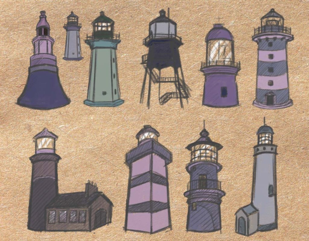


The original visual plan for the film had been to create something with a lot of texture and tapestry-like details, so a lot of the early examples of concept art here feature a of explorations of that. In the more farmhouse like piece at the top, I really went wild with it, incorporating in various fabric and sewn-on like textures, as well as the knit fabric overlay making up the hills, as well as the more painterly details such as the plants.
The later lighthouse bulb concept still features some of these, but as we progressed with production we ended up moving somewhat away from this for the sake of speed, the the flatness and lack of depth remained throughout, which gives the film a really interesting visual appearance, somewhat similar to work done by Cartoon Saloon.
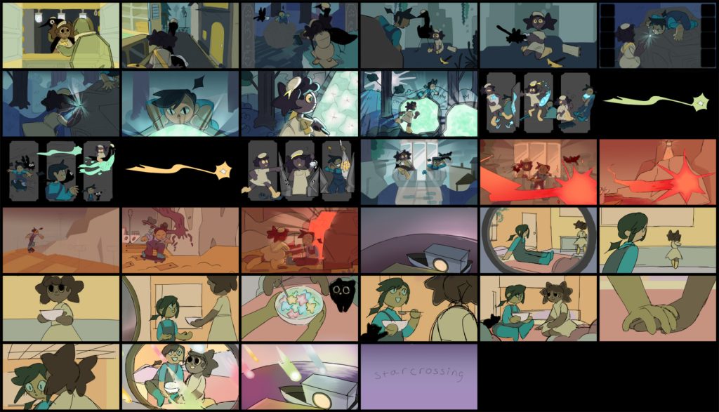

Storyboards drawn by Shay Commander. Colour by me.
As part of my work on concept art, I worked on the Colour Script. I was assisted in this by Shay Commander, the director of Star Crossing.
When creating the colour script, I started by creating a moodboard of all our pre-existing concept art and background experiments to try and get an idea of what colours people had been leaning towards in each environment.
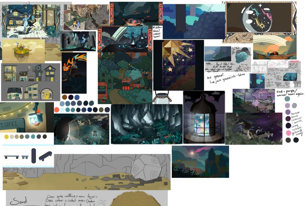
Through this I created a cooler toned yellow and blue palette for the village shot at the start, that transitions well into the cool blues, purples and greys predominant in the rest of Act 1, and providing a nice contrast with the warm colour palette of our final act.
Shay and I wanted to ensure that colours would really mimic the shifts in mood throughout the film, as well as foreshadow the danger of Raine’s injury against the meteor, so we ended up going wild with the overlays at the end of Act 2 to make it very distinct.
There really wasn’t much concept art for Raine’s houseboat interior. I discussed options with Emily Gordon, who had designed the interior layout what she had had in mind, and from that created a warm blue and yellow colour palette. The yellow and oranges would create the cosy feeling Emily had been aiming for, while the blue and teal accents would help link it back to Raine with her distinctive blue colour palette and help indicate without words that this was her home.
I’m really happy with how this all turned out!