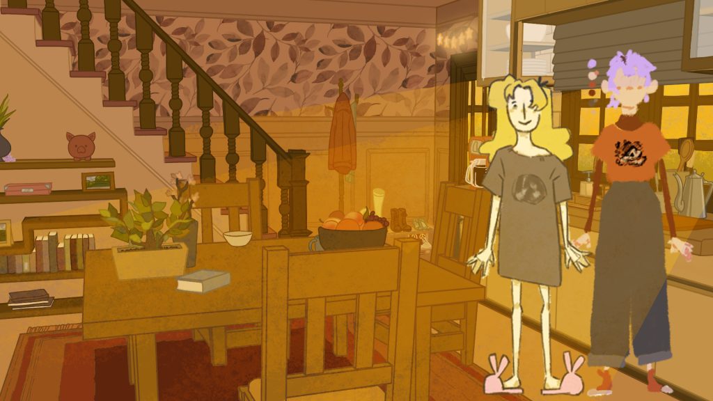
I want to submit this to film festivals, so I can’t have too much of it up when I do so, but this week is the Masters showcase (exciting!) so I wanted to make sure the film was as accessible as possible! On that note, I’d just like to say I’m not sure if it’s possible to download this – if it is, please don’t download this.
It’s not finished right now, but I’m still so proud of what I’ve done! I’ve been working on this almost entirely by myself, and the fact that so much of it is done is something I’m really happy about.
I’ve done so much problem solving over the course of this project and learnt a bunch of new softwares too!
I’ve worked really hard on this, and I hope that’s visible in the final product!
One of my biggest digital art pieces to date – if not my biggest!
When designing backgrounds for the outside world, I chose to be inspired by mangaka’s, and the way they’ll often design backgrounds to save on time. They’ll sometimes just use straight up photos as backgrounds, sometimes put through a filter to look a little more like a drawing. Since I’m trying to work with a somewhat unnatural colour palette, I chose to draw over the photos to create my background within the styles of the interior spaces.
So, I began by using photo bashing to combine various parts of Perth Road, Dundee so that the perspective would look how I wanted it to throughout the entire panning background, but also would feature the buildings I wanted to feature.
This is really my first look at what the exterior spaces of the real world will look like, so it took a lot of time trying to determine the level of detail and what sort of colour palettes I’d use going forward. I wanted to try and carry over little details I’d established in the interiors – such as drawing the individual bricks on the walls – to establish consistency within all my backgrounds. Though even with this in mind. the sheer scale of the background in comparison to the typical HD one I’d usually work towards creating, did mean I had to lose some detail in a few places that wouldn’t be as visible. I also used this as a way to try and better convey things like depth within the bushes.
In terms of colour, I was still keeping with the warm toned colours and variety of browns I’d used in the interior, but overall, I wanted to work a greater number of pinks and yellows into the design, as well as turquoise as a highlight colour, in order to create some contract in the colour palettes to better indicate the change in both scenery and time of day.
In terms of the blocked-out section in the upper left of the background, it’s there due to the strange dimensions this background needed to be to match the planned movements the camera would need to take for my planned shot. None of that space will be needed, so it was easiest to just block it out completely from the get go.
The lighting was a struggle to figure out for me, but was definitely one of my favourite bits to work on!
I wanted to do early morning light, since a big part of the story I want to convey is the passing of time over the course of the day, so I began by looking at a number of referenced of streets at the start of the day. I noticed a lot of the street itself was quite dark, since the sun would be quite low in the sky, so the light would just be peeking over the top of the buildings. Then, I paired that with the more defined rays of light poking through the bushes, that matched the stylised light I had established in some of my earlier backgrounds.
And with that, my biggest digital art piece was done!
If you’ve read my previous posts, you will have seen all of the test and moodboards I’ve carried out trying to find my background style for the day dream sequences in this project.
And… none of them feel quite right!
I want something with a dream like quality to it, but if the background style is too wishy-washy, it doesn’t make for smooth transitions to and from the real life style. So, it needs to be something that still has coloured line art, since that’s such a big part of the way I’ve been drawing the real world – alongside having very flat colours.
So, it was time to try something new!
The main day dreams that need a specific ‘day dream’ background created for them, are the romance segment, and more obviously, the anime section.
So, my main source of inspiration when coming up with a new direction was to look into backgrounds for anime meant to convey psychic power or magic – to reference back to the fact this film is about a telepath, and try and make that more obvious (a few people have critiqued that it’s a little hard to know exactly what is happening in the short film, since there is no dialogue – I hope having more indications of telepathy and a change in title will help make this more clear).
The bulk of the references above are from either Mob Psycho 100 or Puella Magi Madoka Magica.
In Mob Psycho, they use kaleidoscope patterns as an indication of psychic powers, and this is something I want to have directly influence my work. So along with the collaged backgrounds in Madoka Magica that they used to depict witches, I want to incorporate explosions of kaleidoscopes to help transition into the anime sequence, and then have it swirling in the corners of the screen as part of the background.
So, while painting in the background traditionally that I will use for the anime segment, I ended up recording some videos through the lens of a kaleidoscope to use here, which I can then tweak the hue and saturation of until I have the level of contrast I want when paired with my painted background.
Within this video, you can also get an idea of the background I’m going to use! Inspired by a study of a gothic painting I’ve worked on in my sketchbook, I’ve painted lots of little dabs of colour mixed with gold metallic paint to try and create something with the dreamy quality I’m after. These dabs have been painted in concentric rings, so that once I’ve scanned the painting, I can then animate it at the composting stage to slowly spin round, creating the appearance of moving blobs of colours.
I’m very excited for how this collaged background will look!
Lately, I’ve been spending most of my time working on as many of the backgrounds of my short film as I can. So, in a continuation of my last post, I’ve been trying to figure out the day dream world, and part of that is figuring out the ways it’ll move around.
The final shot of my film, shot 37, has been my victim of choice!
The shot features one of the real world backgrounds, and then will transition down into the day dream void. So that it’s not too static looking, I wanted have to some level of animation in there to help transition into the new section of the background.
The daydream parts of this will serve as the background for the end credits of the film, so I want to make sure the movement isn’t too overwhelming, so as not to distract from the text I’ll later put on top, however at the same time I need to make sure it also matches the style from the rest of the film.
To be honest, I’m still not entirely happy with this. I feel like it looks too jittery, though I do think it works as a good proof of concept.
I think I need to find a way to make the movements feel slower and more fluid. I’ve been using Clip Studio Paint for their watercolour brushes, and trying to figure out their animation software has made this whole process a little more complicated, but I think I’m beginning to get the hang of it, and it’s always nice to have a new software under my belt!
Now that I’m officially done with all the storyboarding, I thought it would be prudent to finally figure out what exactly I wanted the day dream world to look like.
I knew I needed it to look very fluid and unstructured, to better contrast the real world, but at the same time, I did still want it to fit the style of the rest of the film, so, I did a fair amount of experimentation here to try and get something that I’d like the look of.
So, in terms of colour, I think 1 and 2 are probably closest to what I was envisioning. The cooler palette in comparison to 4 in particular, means that there will be more contrast between the worlds, and it will also better match the characters I’ve designed already.
1 and 3 would probably be the best option for it I wanted to have the world moving somewhat, since the more defined shapes there would be easier to keep track of when moving about.
However, I think 2 and 4 better capture the more wishy washy, strange swirling void that I was wanting to create, so I think the way to go forward would be to have everything on lots of separate layers, so that I can then add movement in at the compositing stage.
However, I think 2 is a little too noisy overall to really create the misty feeling I was wanting.
So, I think I’ll go with 4 as my main inspiration for the background I’ll create – which was drawn up in Clip Studio Paint using their watercolour brushes, but use some of the more cooler toned colour palettes for it. Then, I’ll add more of the solid rings into the final design as a nod to the 3rd design.
It’s definitely a big relief to have this a little more figured out!
Some more character design here, with a much greater variety of styles than what I first posted on this subject here!
These, are my daydream characters! The whole goal of the day dreams in the first place was to explore a whole variety of different styles and see if I can use hybrid animation to make the animation process for this variety of characters easier!
I’ve enjoyed designing these guys, and getting to explore a whole variety of different styles and influences, while in keeping with the colour palette I’ve already established in my moodpboard for the day dream world.
It was definitely a challenge trying to get the different skin tons to read the way I wanted them to without using any oranges, browns or warm pinks, but I think I succeeded at making something that looks cool at least!
As part of my final outcome for the masters, I’m exploring a lot of different styles, themes and methods of making the film.
Currently, I’m working to finish up the storyboards for this, so I can string them into an animatic. Now, as part of my undergrad, I had it drilled into my head that if I ever want to submit something I make into a film festival, I need to be really careful about putting it online. As of right now, I’m not sure if that’s something I will decide to do, but I would like to leave that option open to me.
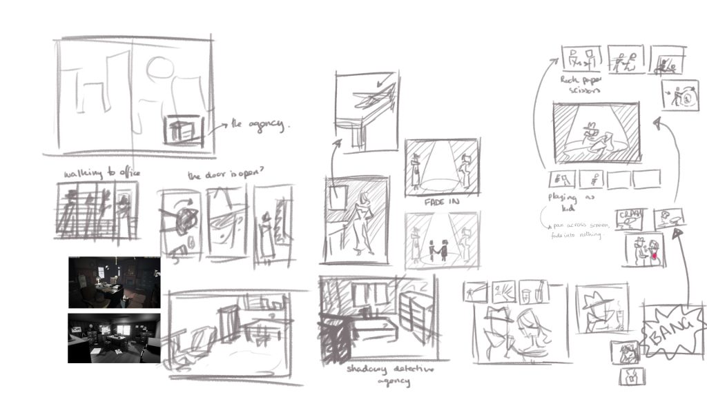
So, to that effect, I’m not posting the full script and storyboards here, but I thought I’d share a little of my progress with one of the sections of the film – namely, as the title off this post suggests, the segment that will be in the style of Film Noir.
To begin with, I wrote up a script.
I’d done some research into this genre back when I was trying to figure out what my project would be, and I tried to apply that to what I was envisioning here too. Things like representations of the past a character most confront, murder and a general hopelessness.
Then, I set about envisioning how I would show this scene, and chose to do so in the form of a motion comic. Unlike a lot o the other day dreams in this film, this stems from a character creating what it is that both we the viewer, and the telepath are now seeing. So, it made sense to me that this would be a slightly different format from any of the other daydreams.
The first step was just planning out what each frame would look like. It’s not exactly pretty, or in an easy to read order, but it got the job done.
Then, it was time to properly storyboard it, and figure out how each frame would fit on top of each other and interact and interlock together. It took quite a while to get to a place where I liked it, but I did end up with something I was happy with and that I look forward to making!
In the name of actually finishing this project sometime this year, as well as keeping a lighter tone to the film as a whole, I did end up cutting a lot of the second half of the film after the introduction of the femme fatale character. The attempted murder and then successful kill don’t really match the tone of anything else in the short, and the halfway point of the planned segment was already going to give me enough material to try stuff out.
Here are all the characters that will feature in the real world section of the short I plan to make! The first seven in the top row, who have swatches next to them will be the protagonist, and the daydreamers. Beyond that, anyone facing forward will be a background character on the bus, while those facing to the side will be characters walking along the street while our protagonist walks to work/University.
I wanted to make sure I’d have a big variety of characters to fill the world in order to make the short feel more lived in and realistic, rather than just have the characters whose daydreams the telepath and the audience are looking in on.
To this end, I got some help from some friends of mine with some of the characters! Shay Commander, Evan Connolly, PJ Fairweather and Emily Gordon were all nice enough to send me some of their character designs for me to adapt into my short! All of their websites/portfolios are linked here.
The six characters that are based on their character designs are labelled in the image above, wherever the text is highlighted in white. For these characters, I changed them all into the style of this short, as well as adapted the colour schemes so that they would fit into the colour family I’ve established for the real world, but also so they’d look less like main characters, and blend into the background a little more.
A good example of what I mean be PJ Fairweather’s character, Carrot – the bouncy orange character five along from the left on the bottom row. Originally, as PJ designed them, this character was much more saturated with bright green hair. Very appropriate for a main character, but less so for a the background character I would be using them as. So, for this version of them that’ll appear in the background of the short, I made their colour palette much darker, and removed the majority of the accent colour so they wouldn’t stand out as much.
Now, admittedly, there are a lot of characters here, but don’t worry! Most of these characters will be barely moving, or just a brief loop that can just be a few frames repeated over and over. The most complicated thing I’ll be animating with these characters will be just a basic walk cycle.
Now, all I have to do on the character design front is figure out the characters that’ll appear in the day dreams! These characters will be quite heavily animated – with a bit of variation depending on what style they are supposed to mimic – so will be much simpler overall. I’m working on storyboarding at the moment, but I’ll get onto that soon!
I’ve been working on the script for this short, which I figured would be pretty dull to just sit and read through, then started on storyboarding – which I don’t really have enough to post yet – and then assessment was officially kicking my butt. It’s been a busy few weeks..
But, I survived!
So, as per the advice of my tutors, I’m focusing on getting the character design done so I can actually begin to do animation tests. I’m not going to spend too long on this, so there won’t be a ton of progress updates on this. Character design isn’t my specialism, nor do I want it to be, and by the nature of the short I’m making, there’s a lot of characters to get through. So, for all of the ‘real world’ characters, I’m going to churn them out as quickly as I can – taking inspiration from the people around me, as well as some of the excellent character designs of my friends (who I’ll link to where you can see their work when I get their characters drawn up in the style and colour palette of my film) to pad out the backgrounds of certain shots.
For the day dream characters, I will spend a little longer working on them. These characters will need to honour/parody the styles they’re representing, so I’ll need to do some research on the staples of each genre beforehand to more accurately mimic them.
Before I sign off though, here is a quick colour test of two of the characters I do have already pretty ironed out at this point! This serves to see if their colour palettes are harmonious with the background concept without having them blend in too much, as well as whether they stand out more with black outlines or should have coloured ones.
It’s not a perfect test, but I think the black outline helps them stand out from the background’s coloured line art. Stops it being too catchy-matchy as it were.
Again, not a super fancy test, I literally just dropped a copy of the colour layer and then a complete character from where I’ve been sketching them out onto my background file, but so far I’m really liking how they look!
Part draw of the short I want to produce, is the many different styles of animation that will feature in it as part of the various day dream sequences. I don’t imagine any of them will be hugely long, probably just close to the length of a cut-away sequence in a show like Family Guy.
I thought it would be a good idea to start compiling some of my main inspirations for things like choreography, compositions and subject matter, now that I’ve finally solidified the main styles I wasn’t to explore, as part of the beat boards uploaded in yesterdays post.
For the anime fight, these videos serve predominantly as inspiration for the choreography. The Amazing World of Gumball fight is particularly good fro inspiration here, since it is wanting to represent, imitate and parody anime, and honour the style of it much as I am wanting to do, so features a lot of the predominant cliches and tropes of the genre fights.
The next day dream sequence would be something trippy and psychedelic where everything is morphing into and out of itself. Here, my inspirations are much more for the style of the piece.
Another style inspo here. This short is one meant to mirror the typical film noir style, which is what I want to really focus on capturing in my own noir style sequence. When I was trying to figure out what my final outcome would be, I was looking into various styles I was interested in to see if that inspired anything. I looked into some of the themes of the noir genre then, and I’d like to see if I can incorporate some of those into whatever I end up creating too, things like separation from your past, jealousy, nihilism and the senselessness of life.
I don’t know how I’d be able to get that all into only a few seconds, preferably without any dialogue, but I’ll certainly try my best!
Final distinct style I want to try and incorporate at this point would be something inspired by pixel art! For this, I was also inspired by the Simpsons pixel art style opening [https://www.youtube.com/watch?v=FIZ_gDOrzGk] but sadly it wouldn’t let me embed it, so here’s the link.
Of all the styles here, this is the one I’m least attached to, and I feel like it’s the most crammed in in the storyboards too, so if timing becomes an issue, I could definitely afford to loose it.
I think it could be interesting to animate though! My flatmates were actually the ones to introduce me to this worthikids video, and we were hypothesising that it was likely made my by animating it in 3D first, and using some sort of filter on it, so that will be interesting to look into.
And maybe it would let me incorporate some of my fight forge stuff too!
Hofmann, S (2015). Elements of Film Noir and its Implementation in the Contemporary TV-Series “True Detective”. Available at: https://www.grin.com/document/319941#:~:text=Noir%20themes%20and%20moods%20include,confrontation%20with%20that%20past%20(Conard (Accessed 21 Nov 2023)